Get In Touch
dhroovmahajan13@gmail.com
Ph: +91.926.798.7269
Work Inquiries
Linkedin
Branding Campaign Mockup December 25, 2024

Transactional Emails

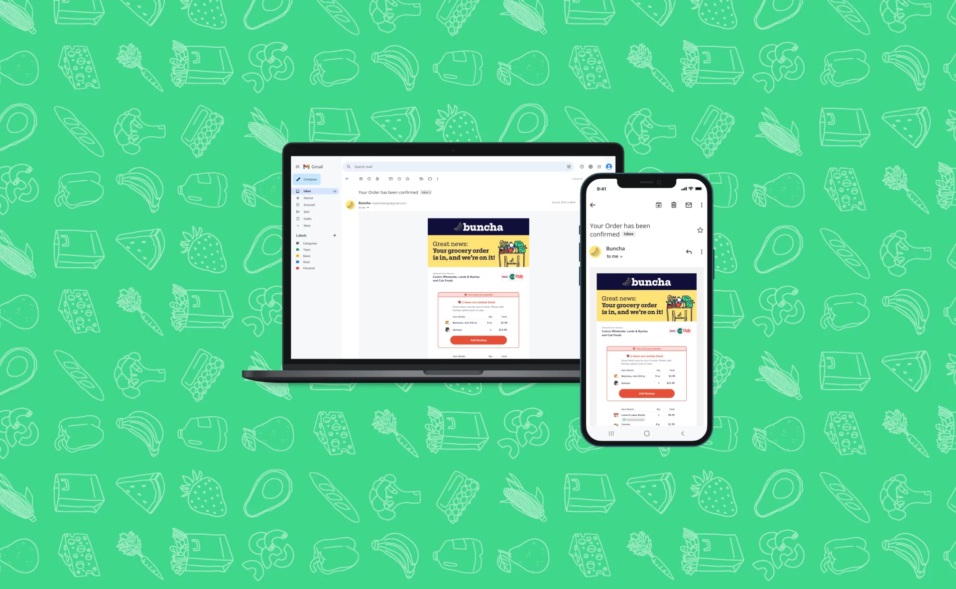
We focused on solving and converting multiple emails into one single communication as well revamping and giving a new look to the transactional emails, our major focus was on making the email dynamic as per the order status.

Task

Unify the communication before Shop start and Post Shop and ensure that customer is getting single communication for group Order.
  • Strategy

    Brand, UX Strategy

  • Design

    UI/UX Design, Art Direction

  • Client

    Buncha

About Buncha

Buncha is a grocery delivery service focused on affordability, convenience, and eco-friendliness. Buncha connects neighbors with retailers for scheduled deliveries throughout the week. Zip code-based schedules give neighbors the option to join delivery times, allowing Buncha to aggregate orders onto refrigerated trucks and create highly efficient delivery routes. With store partnerships and condensed routes, Buncha is able to provide consumers with the most affordable way to get their groceries delivered.

Before we begin

Buncha’s unique selling price is that Buncha is the only delivery company that sells or delivers items from multiple stores in a single delivery.

How it works?
Multiple shoppers are assigned to shop from multiple stores and after shopping, have to load the items in a single van.

This Unique feature is known as Multi Cart.

Problem Statement

Now that you know what multi cart is, lets dive into the problem. Many Users are complaining that they are getting multiple communication when they make a multi-cart transaction. And since multi cart is a new feature, we’ve to update our comms accordingly.

Task

Need to unify the communication before Shop start and Post Shop and ensure that customer is getting single communication for group Order.
Email Designs

For new email designs, I started my approach by communicating with product manager, brand manager and product lead, to prioritize information and what would be beneficial for us as well as the user.


Development Limitations.

As a Product designer, I should also keep in mind of what is achievable or what is not. So during the brainstorming phase I included some developers as well to show them the ideas and based on their feedbacks and suggestions I made the changes accordingly and created the MVP.

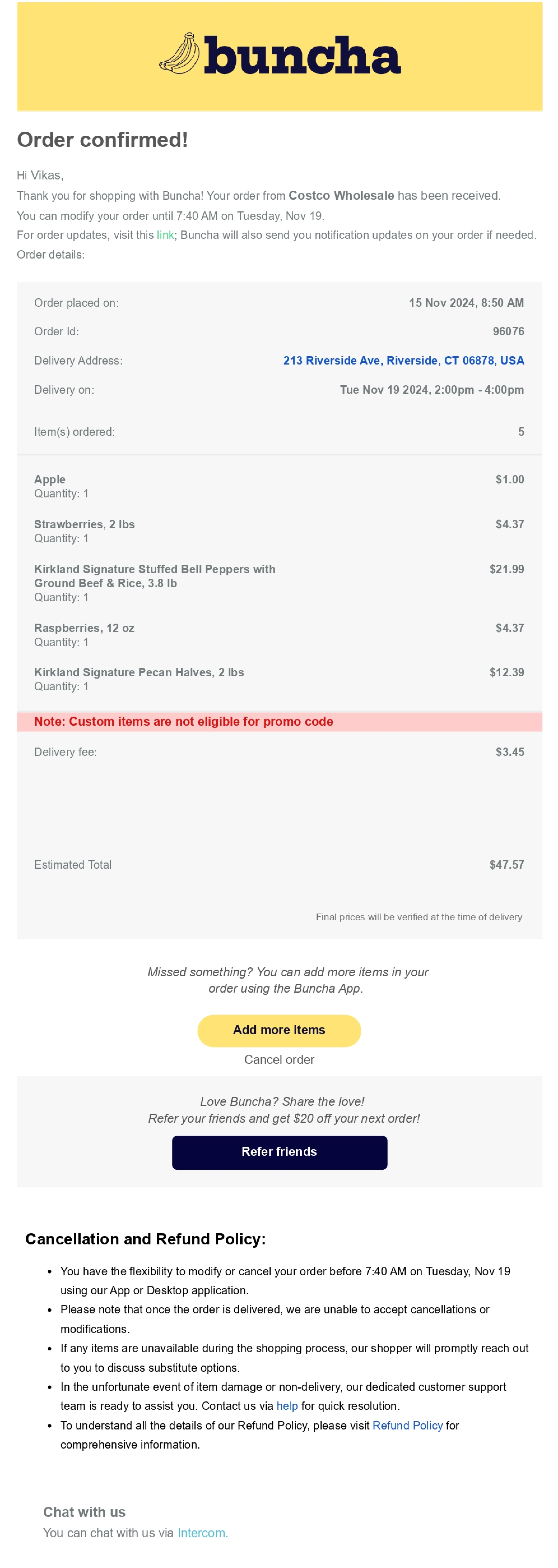
Order Confirmation (old)

Order confirmation mail is sent to the user when they’ve successfully placed an order with Buncha. 

Previously, let’s suppose if I ordered from 3 stores as a group order the user used to receive 3 separate emails for those particular stores.

Also, there is no proper distinction between each elements and makes the recall each item since there are no image associated along each item.

Order Confirmation (new)

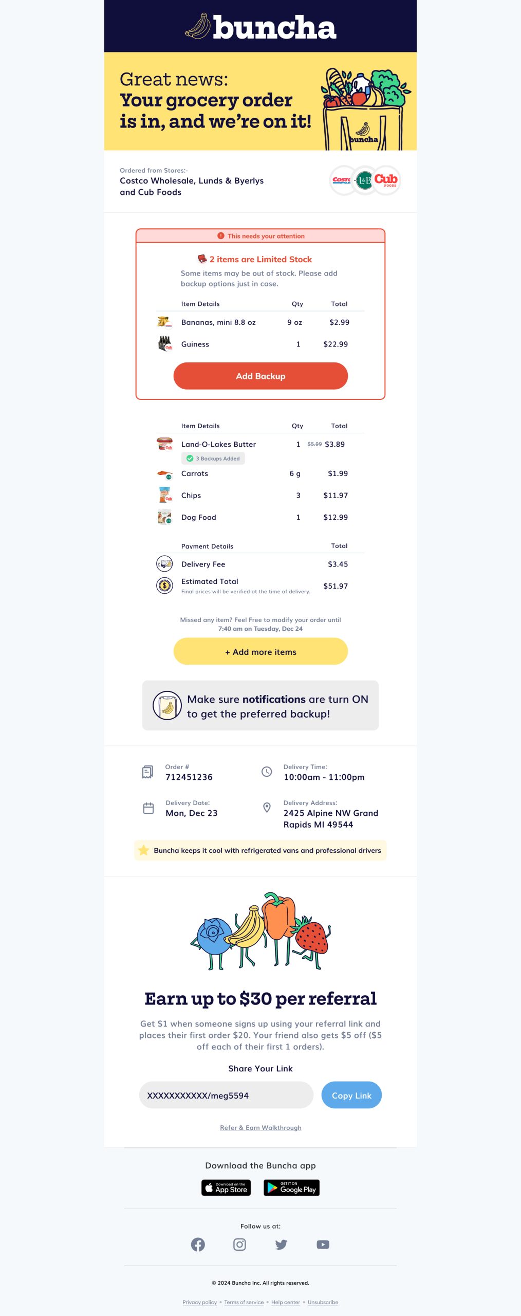
New changes included giving the email a look similar to the Buncha Brand. I opted for the brand’s colors and created a proper callout where the user can easily know the status of the order.

Below the header, we’re informing the users what stores they’ve ordered from. A proper section showcasing the limited stock items in case users wants to avoid that by adding a backup.

Revamped the entire item section component so that users can recognize what they’ve ordered rather than recalling.

And towards the end a little of self promotion so that more users can land or order from Buncha.

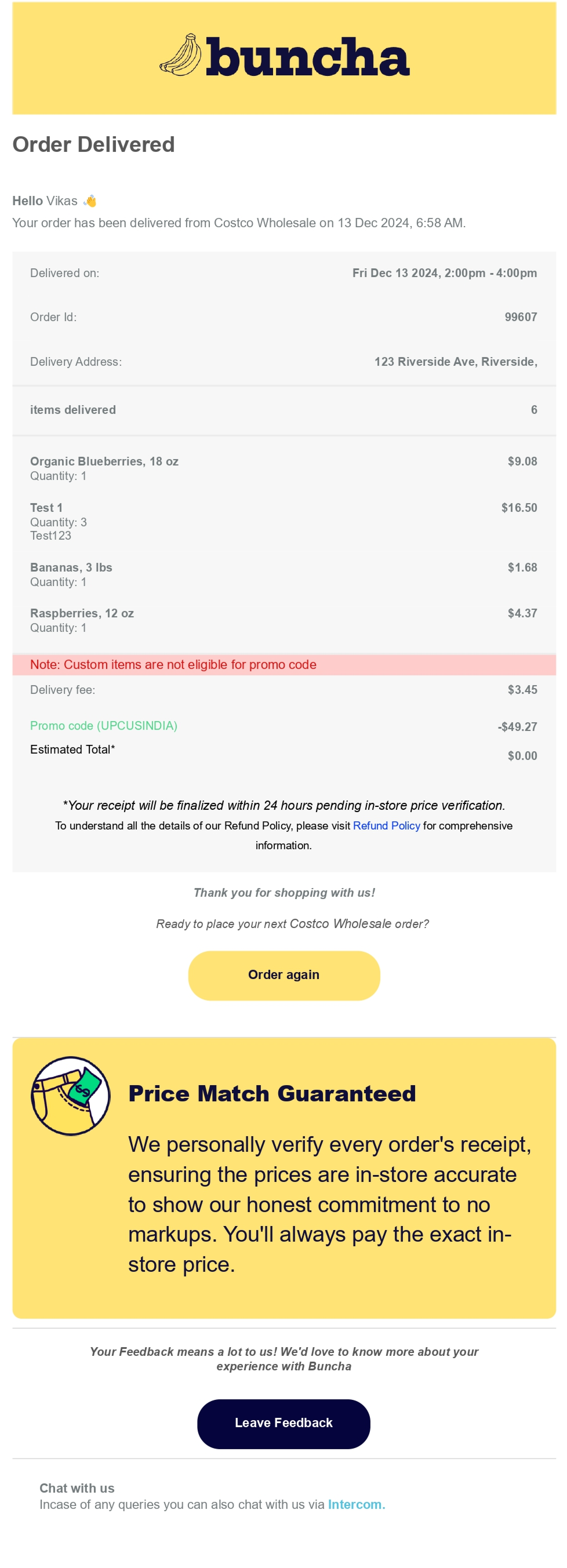
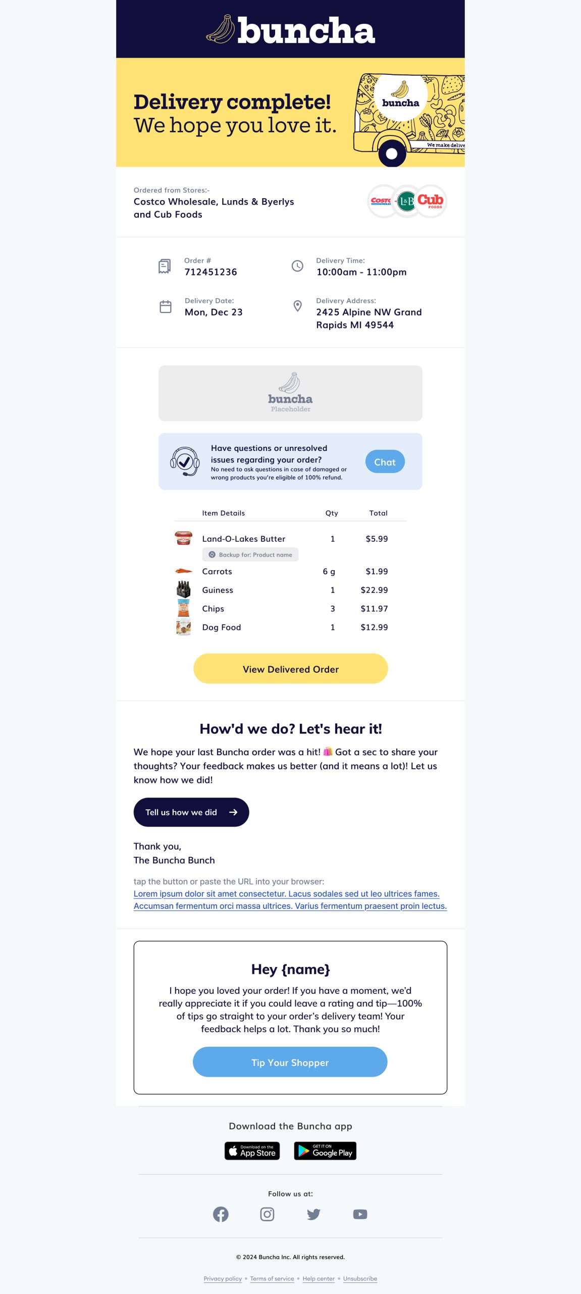
Order Delivered

As the name suggests order delivered email appears when the order has been successfully delivered. Layout of components of the email will change according to the status of the order. We’ve carefully taken into consideration of what component would be beneficial to the customer at what stage.

Old design

New design

Order Receipt

Order receipt is the digital receipt that users get and is usually generated with the final price after a day of the order delivery.

Old design

New design

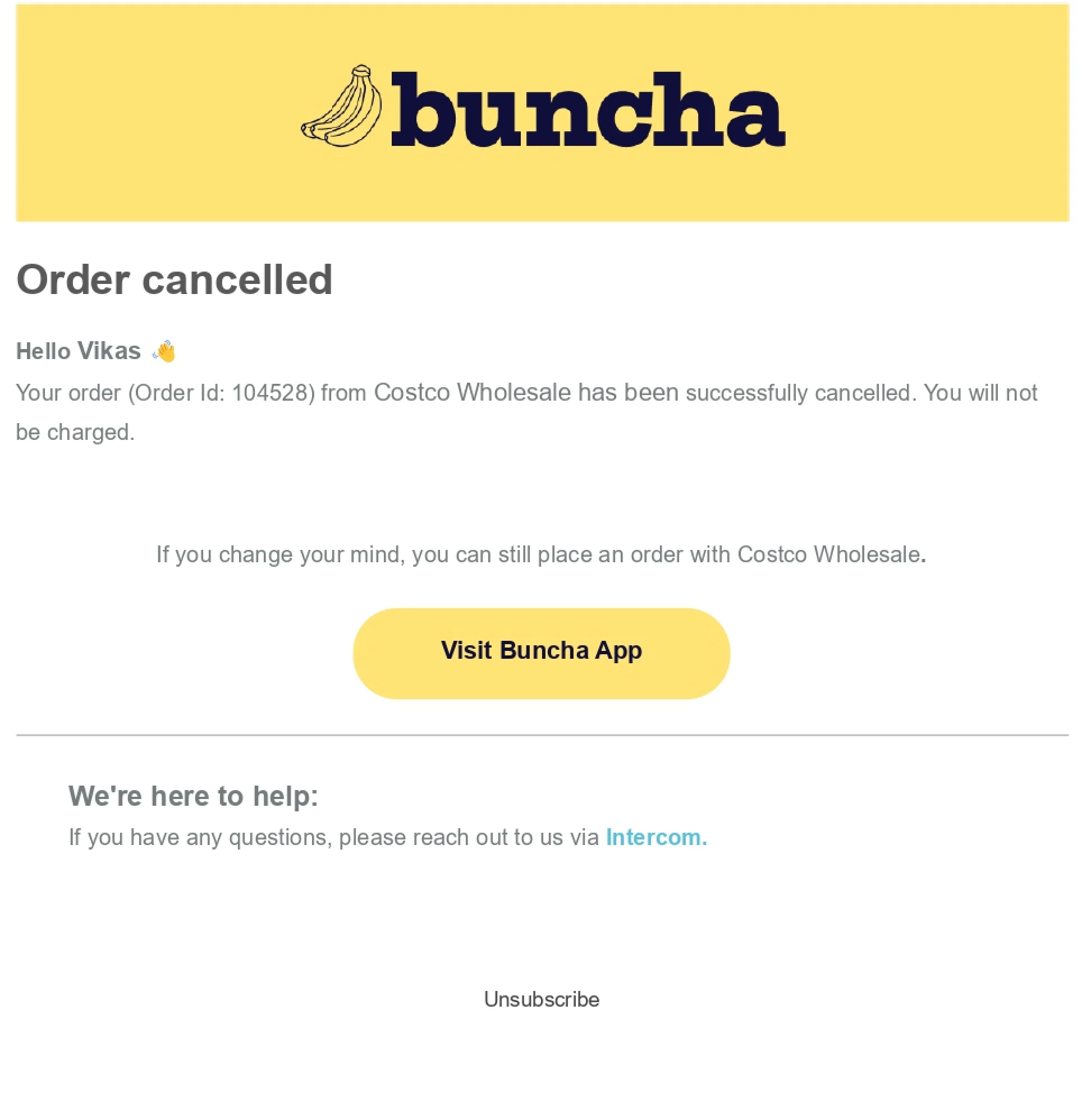
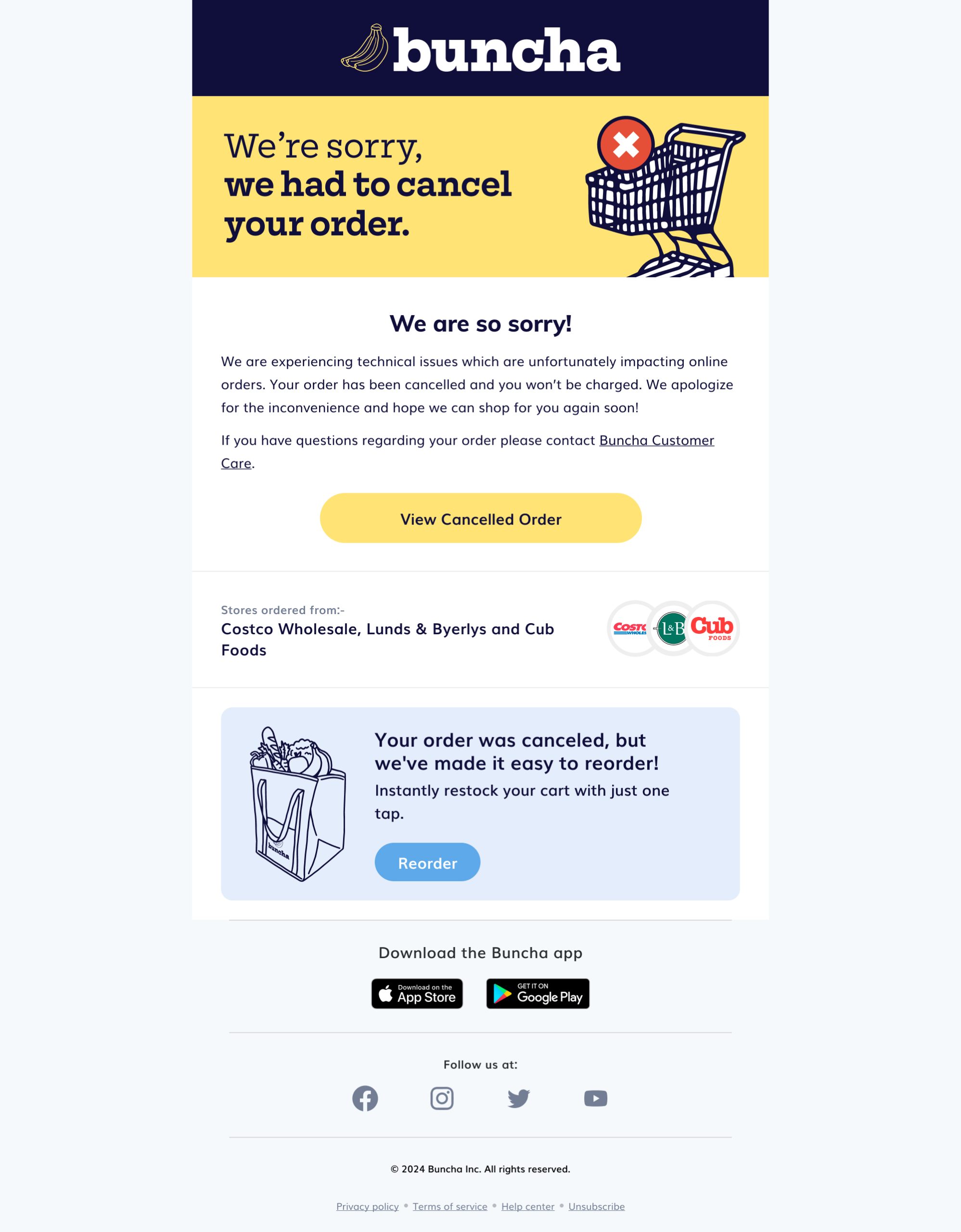
Order Cancellation

After cancelling an order, previously there not much the user can do except only visiting the application. And let’s assume if there were 3 stores from which the user ordered from we used to send 3 separate emails which can easily overwhelm the user even by just looking at it. 

In the new ones we’re trying to create some empathy by tweaking the ux writing as well as letting the user add the cancelled order into a new one and order again the same items.

Old design

New design

Learnings...

Email… emails…. and emails, ever since the beginning of the internet we all get a lot of emails, so much that we have either delete or leave them on unread. While creating this project we have to make sure that the customers are not treating us the same way. We have to create or design emails in such a way that would easily grab the attention of the user. Iterations after iterations, what’s possible, what’s not, and considering everything here we are. This project taught me how much important emails are for your business as well as for your customers. Miss one email and you might miss an item.

Back

1 comment

Leave a Reply

Your email address will not be published. Required fields are marked *